Understanding how to create a product positioning map is one of the most powerful ways to sharpen your brand strategy and outpace competitors.
A well-crafted map gives you a clear visual of where your product stands in the market – and just as importantly, where opportunities lie. Instead of guessing how customers see your brand, you’ll uncover how they truly compare it to others based on what matters most: price, quality, value, and perception.
Whether you’re launching a new product, refining your messaging, or exploring new market segments, a positioning map helps turn scattered insights into strategic clarity. It’s a simple yet data-driven tool that guides smarter marketing, pricing, and product decisions.
In this guide, you’ll learn everything about creating a product positioning map step-by-step – from defining your goals to interpreting results — so you can position your brand where it stands out and wins consistently.
Why Product Positioning Maps Matter
A brand positioning map helps you see what others can’t—the market gaps no competitor currently owns. Those open spaces on the map are where opportunity lives: untapped audiences that no one’s serving yet, waiting for the right brand to show up.
These maps help product and marketing teams understand competition on a deeper level than side-by-side feature lists ever could. Instead of just knowing that Competitor A charges $50 more, you’ll see how customers actually feel about that price in relation to quality, support, or overall experience.
They also bring clarity to decisions that shape growth—pricing, features, and audience focus. With a clear visual, you can instantly spot where your brand can stand out and win. Tesla once mapped electric vehicles by performance and sustainability, realizing they could lead on both fronts at once—a move traditional automakers never anticipated.
Research backs this up. Companies that use structured positioning analysis are 60% more likely to uncover profitable market opportunities than those relying on informal assessments. Because maps turn complex data into simple, visual insights, they help teams and executives get aligned faster and act with confidence.
Most importantly, a brand positioning map keeps you from falling into the trap of competing on features alone. Instead of racing to match prices or specs, you find a space that’s uniquely yours—one that builds real, lasting advantage. That clarity becomes the base for everything you do next: messaging, pricing, and product direction.
Step-by-Step Guide to Create Your Product Positioning Map
Creating a brand positioning map is about clarity—understanding exactly where your product stands in the minds of your customers. It takes structure, attention to detail, and a sharp focus on what really matters to your audience.
Here’s the process successful companies rely on to build positioning maps that don’t just look good on paper—they guide real business growth and help you make smarter, faster decisions.
Step 1: Define Your Objectives and Choose Axes
Start by getting crystal clear on what you want this analysis to uncover.
Are you looking for pricing gaps in your market?
Comparing how your features stack up?
Or maybe you’re trying to uncover underserved segments with untapped potential.
Your objectives will guide every move that follows, so set them early and keep them focused.
Next, choose the two attributes that truly matter to your audience—the ones that shape consumer perception and influence consumer preferences most. These should reflect opposing values that create meaningful contrast in your market.
For example, laptops often plot along Price versus Performance, showing the gap between budget models and high-end machines. In software, Ease of Use versus Features separates simple tools from full-scale platforms. Delivery services naturally fall into Speed versus Cost, highlighting the trade-offs buyers consider every day.
What matters most is grounding your choices in what customers actually value, not what’s easiest for your team to measure. If research shows users of financial software care more about security than speed, don’t default to speed because it’s simpler to quantify. Real insight comes from mapping what drives decisions, not what’s convenient to track.
Finally, test your axes. Run a quick check with a handful of target customers and ask, “When comparing products like ours, what two factors matter most to you?” Their answers will confirm whether you’ve chosen the right dimensions, or reveal adjustments before you invest time in full mapping.
Step 2: Identify Competitors to Include
Start by listing 7–10 direct competitors offering similar products to your target audience.
These are the brands going after the same customers, budgets, and problems you’re solving. But to get a full picture of how consumers perceive the landscape, you’ll also want to include indirect competitors—those solving the same need in a completely different way.
For instance, if you’re analyzing project management software, your direct competitors are ActiveCollab, Asana, Monday, and Trello. Yet Excel can be an indirect one for quick tracking, Slack for team communication, or even pen-and-paper methods that some teams still swear by. All of them compete for the same attention and problem space, just with different approaches.
Don’t overlook the market giants. Even if they’re not active in your niche today, players like Amazon, Google, or Microsoft can shift your market overnight. Including them helps you anticipate how future changes might impact your marketing efforts and product strategy.
Next, look at up-and-coming players—startups that customers mention in reviews, forums, or social media. They might not own large market share yet, but they often signal where the market’s headed next. Tools like G2, Capterra, and industry reports make this discovery process faster and more accurate.
Last but not least, listen to your customers! Ask, “What other options did you consider before choosing us?” and “If our product didn’t exist, what would you use instead?” Their answers reveal how consumers perceive your competition in real buying situations—insights that no spreadsheet or keyword tool can fully capture.
Step 3: Collect and Analyze Data
Now it’s time to gather the facts that will shape your map!
Start by pulling quantitative data from multiple trusted sources—pricing pages for cost comparisons, product specs for feature depth, and customer reviews for real-world experience. Add third-party insights from firms like Gartner or Forrester to round out your view of the competitive landscape with objective benchmarks.
Then, go deeper with qualitative insights. Numbers tell part of the story, but understanding why customers choose one brand over another brings it to life.
Focus groups uncover emotional drivers, while social media sentiment shows how people talk about products in their natural conversations. Communities like Reddit or niche industry forums are goldmines for unfiltered opinions and authentic feedback.
Create a consistent scoring system for your axes, whether it’s a 1–10 scale or standardized metrics. If price is one of them, decide if you’ll use actual amounts, pricing versus the market average, or perceived value. Consistency ensures your map reflects reality, not bias!
To make it stronger, bring your customers into the process. Surveys help capture how buyers see every major competitor on your chosen attributes. This thorough market research often exposes surprising gaps between internal assumptions and how the market truly views each brand.
And don’t stop there!
Platforms like SimilarWeb reveal web traffic trends, App Store ratings highlight user satisfaction, and company reports offer clues about market strength and investment focus. By blending multiple data points, you get a complete, trustworthy view of the competitive landscape – the foundation for an accurate and actionable positioning map.
Step 4: Create the Visual Map
Now comes the fun part – turning all your research into a clear visual that captures your market positioning at a glance!
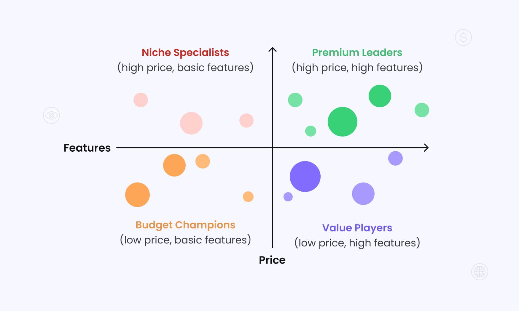
Start by drawing two perpendicular axes with precise labels and value ranges that fit your data. For instance, your horizontal line might represent Price (low to high), while your vertical one shows Features (basic to advanced). Make sure those scales truly reflect the spread of options in your market, not just a narrow view.
Next, divide the chart into four quadrants and give each one a name that instantly tells a story.
Skip vague titles like “Quadrant 1.” Instead, use descriptions that connect to strategy, such as Premium Leaders (high price, high features), Budget Champions (low price, basic features), Value Players (low price, high features), and Niche Specialists (high price, basic features).These labels make it easier for your team to align around how each segment fits into your overall market positioning.
Plot your competitors one by one – each as a circle or shape sized by market share, revenue, or another key metric. This helps visualize who dominates, who’s emerging, and where your biggest opportunities lie. Always place your own brand last to keep the assessment objective and data-driven.
For tools, start simple. Excel or Google Sheets work perfectly for first drafts, while platforms like Miro or Lucidchart can create polished visuals once your analysis deepens. The value isn’t in the tool—it’s in the clarity your map delivers.
Finally, enhance your visual with color coding. Use different colors to show company size, customer satisfaction, funding stage, or even founding date. Layering these insights can surface hidden trends and sharpen the story your map tells. This clarity will later feed directly into your positioning statement, ensuring every message you craft reflects where your brand truly stands in the market.
Step 5: Interpret Results and Identify Opportunities
Once your map is complete, it’s time to turn visuals into strategy.
Start by studying where competitors cluster—it reveals both crowded markets and open spaces. If several brands sit in the low price, basic features quadrant, that area is likely oversaturated and price-driven. In contrast, sparsely populated areas can highlight where to identify gaps—potentially profitable spaces where unmet customer needs exist.
But before jumping in, validate those gaps carefully!
Empty spaces don’t always signal opportunity. Sometimes they exist because demand is too low, margins are unsustainable, or technical barriers make certain combinations unrealistic. The goal isn’t to fill every gap—it’s to find the ones that align with genuine customer value and your strategic strengths!
Next, analyze your brand’s position relative to both customer preferences and competitive threats. If you’re surrounded by similar players, it’s a sign to sharpen differentiation or consider subtle repositioning. If you stand alone in a quadrant, decide whether that isolation represents a strategic advantage—or if it means you’ve drifted from where the market currently values most.
From there, explore how small shifts might improve your stance. Pricing tweaks, refined messaging, or product enhancements can move you into stronger territory with less direct pressure. Even minor changes in perception can reposition you into a quadrant with healthier demand and more sustainable margins.
Finally, look for trends over time. If historical data shows competitors gravitating toward certain quadrants, take note.
Are buyers leaning toward premium solutions?
Are low-cost providers expanding features?
Spotting these directional shifts helps you anticipate where the market’s heading—so your positioning evolves ahead of competitors, not behind them.
Types of Product Positioning Maps
Different types of maps reveal different insights about your market. Choosing the right one depends on how your customers and target audience make decisions—and how much data you have to work with.
Perceptual positioning maps focus on how customers feel about brands rather than what’s technically true. Built from survey responses and perception data, they show how consumers actually view competing products in the real world.
A budget laptop, for instance, might rate high on value even with modest specs—because people believe it delivers great performance for the price. That perception is what truly drives behavior.
Tools like a perceptual map maker make it easy to visualize these insights and see how your brand stacks up.
Attribute maps, on the other hand, rely on hard data. They compare measurable characteristics like price, performance, or feature sets—perfect for markets where buyers base decisions on concrete specs. In the auto industry, mapping vehicles by horsepower and fuel efficiency provides a clear view of which brands deliver power, economy, or both.
Then there are multi-dimensional maps, designed for complex categories with multiple purchase drivers. They let you analyze three or more variables at once—like battery life, camera quality, and price for smartphones. Visual elements such as color or shape can layer in extra dimensions like brand reputation or market share without overwhelming the viewer.
Here’s the bottom line: match your map to how your market really works.
If customer emotions and perceptions rule (think consumer goods or lifestyle brands), perceptual maps are your go-to.
If decisions hinge on tangible specs, attribute maps give you the clarity you need.
And when your product or category demands deeper analysis, multi-dimensional mapping provides a rich, data-backed view without losing focus.
Real-World Examples and Applications
In the software world, Slack built its early success by positioning itself against Microsoft Teams along Ease of Use versus Enterprise Features axes. Microsoft leaned heavily on integrations and advanced security, while Slack focused on effortless setup and intuitive design. That difference in customer perception helped Slack win over small and mid-sized teams long before Microsoft leveraged its corporate reach to catch up.
Tesla completely redefined the automotive landscape by mapping Performance against Sustainability. Traditional automakers believed customers had to choose between eco-conscious driving and excitement behind the wheel. Tesla shattered that assumption, proving both could coexist. This bold shift didn’t just attract a new audience; it set off market trends that forced the entire industry to rethink what an electric car could be.
In the food delivery race, DoorDash found its edge against UberEats by focusing on Delivery Speed versus Restaurant Selection. While UberEats chased faster drop-offs, DoorDash championed choice—partnering with local favorites and expanding selection, especially in suburban areas. That move aligned perfectly with customer perception, appealing to users who valued variety over speed.
Netflix followed a similar pattern when it positioned itself against traditional cable TV using Convenience versus Content Variety. Cable had massive libraries but came with rigid schedules and location limits. Netflix flipped the model—on-demand, anywhere access, even if the early catalog was smaller. As its content grew, Netflix moved naturally into the high-convenience, high-variety space, reshaping entertainment market trends worldwide.
And then there’s the smartphone industry—a perfect study in how positioning evolves. Early iPhones centered on Simplicity versus Functionality, standing apart from BlackBerry’s business-first complexity. Over time, as touchscreens became the norm, the competitive map shifted to Ecosystem Integration versus Customization. Apple continued to dominate on integration, while Android capitalized on flexibility—each winning in line with shifting customer perceptions and long-term market trends.
Best Practices and Common Mistakes
Keep your positioning maps alive—they’re not one-and-done exercises. Review and update them quarterly, or anytime a major competitor launches a new product, shifts pricing, or changes direction. Markets move fast, and what was true last quarter might already be outdated. Set calendar reminders to revisit your maps so your insights always reflect today’s marketing strategy reality.
When choosing axes, focus on what truly differentiates brands and shapes how customers perceive your category. Avoid metrics that don’t matter to buyers or show little variation among competitors. If everyone scores the same on one attribute, that axis won’t help you make better decisions. Internal performance metrics might feel important, but if they don’t influence purchasing behavior, they add noise, not clarity.
Always include the voice of the customer. Surveys, interviews, and review analysis reveal what people genuinely value. Your engineering team might believe technical specs drive decisions, but users might actually care more about simplicity, support, or overall experience. Real positioning insight comes from aligning your brand promise with what your audience actually wants.
Put your maps to work across the company. They should inform product roadmaps, guide pricing adjustments, and shape your messaging. If your marketing strategy doesn’t pull from these insights, the map becomes a missed opportunity instead of a competitive advantage. Be especially careful about bias—rating your product too generously or competitors too harshly distorts reality. Rely on verified data and customer input to keep your analysis objective.
Simplify wherever possible. A map cluttered with 20 brands and 10 variables is hard to read and harder to use. Focus on your top 8–10 competitors and 2–3 attributes that truly move the market. That clarity makes it actionable and keeps your team aligned.
Also remember: correlation isn’t causation. If premium-priced brands cluster together, it doesn’t automatically mean higher prices drive success—quality perception, trust, or target audience might be the real reasons behind it.
Most importantly, treat positioning as a continuous discipline, not a one-off project. The real value comes from watching how positions shift and how customers perceive brands over time. When you build this analysis into your strategic cycle, you turn your maps into living tools that evolve with your market.
Done right, positioning maps combine analytical rigor with customer empathy. They help you strengthen your brand promise, refine your marketing strategy, and anticipate where the market is headed next. Because the brands that master positioning don’t just see where they stand today—they know exactly where to move next to win tomorrow.
How RedTrack Complements Your Positioning Strategy
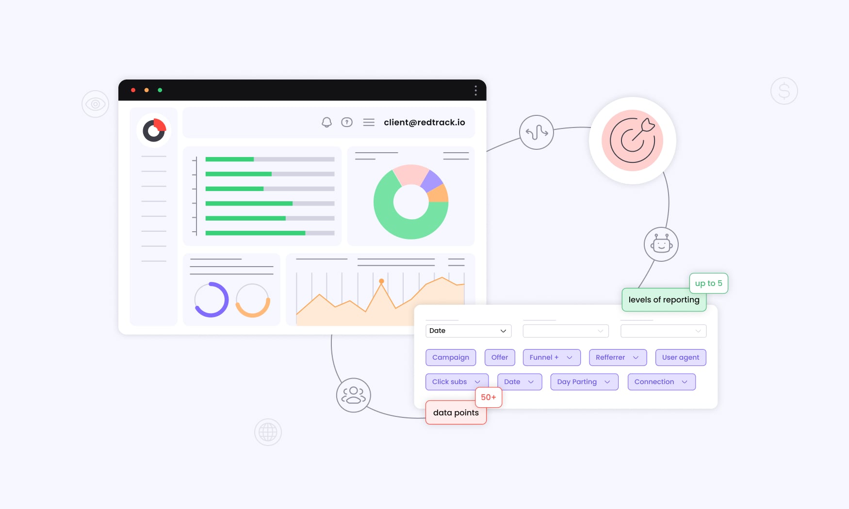
Understanding where your brand stands on the map is just the start — the real challenge is proving that position in the market.
That’s where RedTrack steps in. Once you’ve defined your strategic positioning, RedTrack helps you see how it performs across every ad channel in real time. You’ll know which messages convert best, which audiences respond strongest, and where your budget actually drives growth.
By connecting attribution, automation, and analytics in one place, RedTrack turns your positioning strategy into measurable results. You can test different value propositions, validate assumptions about customer perception, and fine-tune campaigns to reflect how people truly experience your brand.
In short, a positioning map shows where you want to win. RedTrack shows how you’re winning — and where to go next.